YouTube Thumbnail Best Practices: The Three-Element Rule That Gets More Clicks
Learn the youtube thumbnail best practices top creators use to get more clicks. The three-element rule keeps your thumbnail design clean, bold, and impossible to scroll past.
Details
YouTube Thumbnail Best Practices: The Three-Element Maximum Rule Every Creator Needs to Know
You spend hours filming, editing, and perfecting your YouTube video. You craft a compelling video title. And then you slap together a thumbnail in five minutes and wonder why nobody clicks.
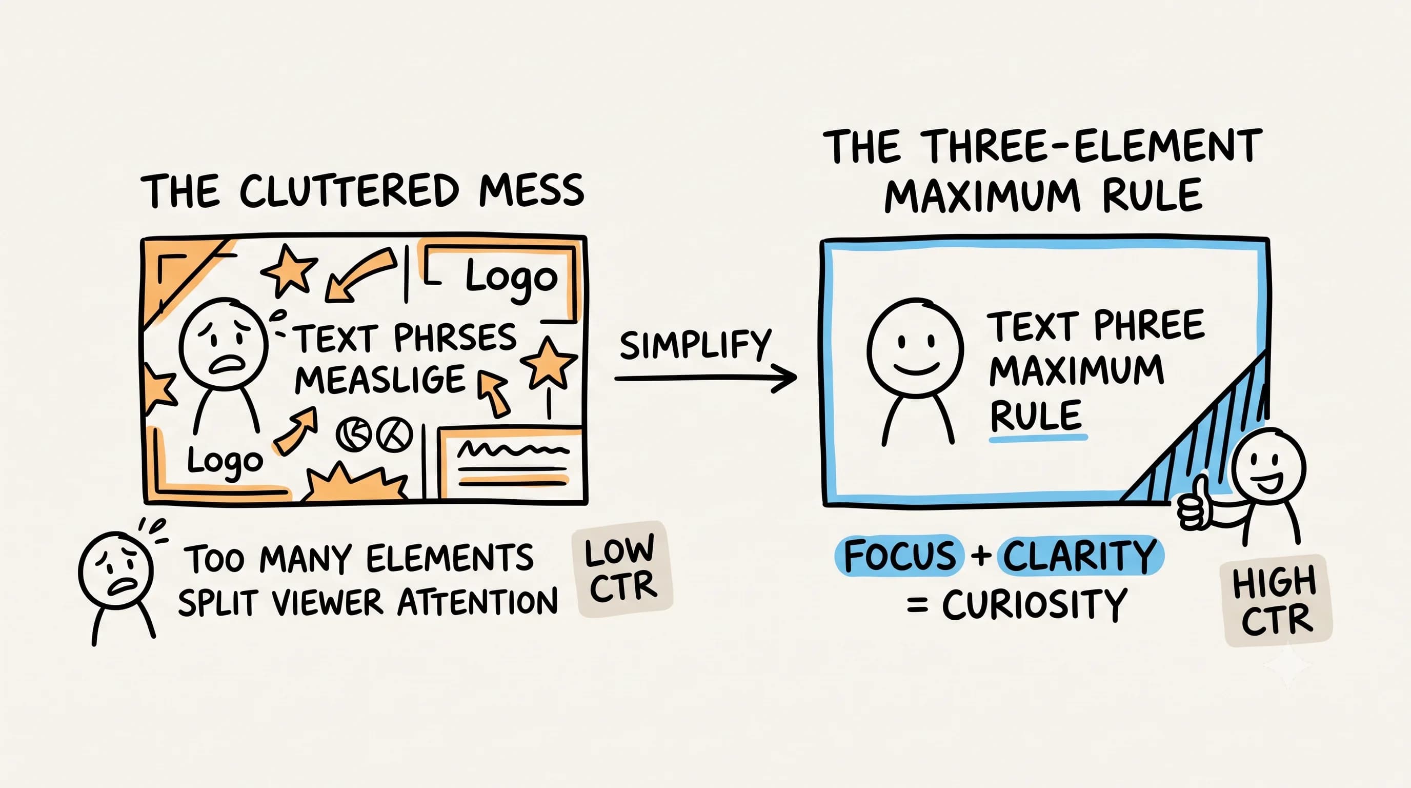
Your thumbnail is doing more damage than you realize. Most creators overcomplicate their thumbnail design, cramming in logos, multiple text lines, arrows, borders, emojis, and stock images all at once. The result? A cluttered mess that viewers scroll past without a second glance, especially on mobile where your thumbnail image is roughly the size of a postage stamp.
The creators pulling in millions of views have figured something out that most people ignore: less is always more. The best thumbnails are often the simplest ones. And once you understand the three-element maximum rule, you will never look at your thumbnail strategy the same way again.
Why Most YouTube Thumbnails Fail to Grab Attention
Before talking about what works, let us talk about what does not. Open YouTube right now and search for any topic in your niche. Look at the thumbnails from smaller creators versus the top creators. Notice something? The thumbnails from top creators are clean, bold, and instantly readable. The thumbnails from struggling creators are busy, cramped, and confusing.
This is not a coincidence. YouTube is fundamentally a game of click-through rate. If your thumbnail does not grab attention and communicate value in under a second, the algorithm has no reason to push your video. Every element you add to your thumbnail that does not serve a direct purpose is actively working against you.
Connor Flannery puts it plainly: "Never use more than 3 elements in a thumbnail. Every element you add splits the viewer's attention." That attention fragmentation is the core problem. The human brain processes images faster than text, but it also gets overwhelmed quickly. When someone scrolls their feed, they are making split-second decisions about what to watch. A cluttered thumbnail forces the brain to work harder to extract meaning. A clean, focused thumbnail communicates instantly. That instant communication is what drives the click.
According to TokCalc, an element is anything you can point to and name: a face, a word, an icon, an arrow, an emoji. By that definition, thumbnails with more than three elements consistently underperform because attention gets split and the story becomes unclear at feed size. You've probably experienced this yourself when scrolling past a thumbnail and not being quite sure what the video is actually about. That confusion is almost always caused by too many competing elements.
The Three-Element Maximum Rule Explained
What the Rule Actually Means for Thumbnail Design
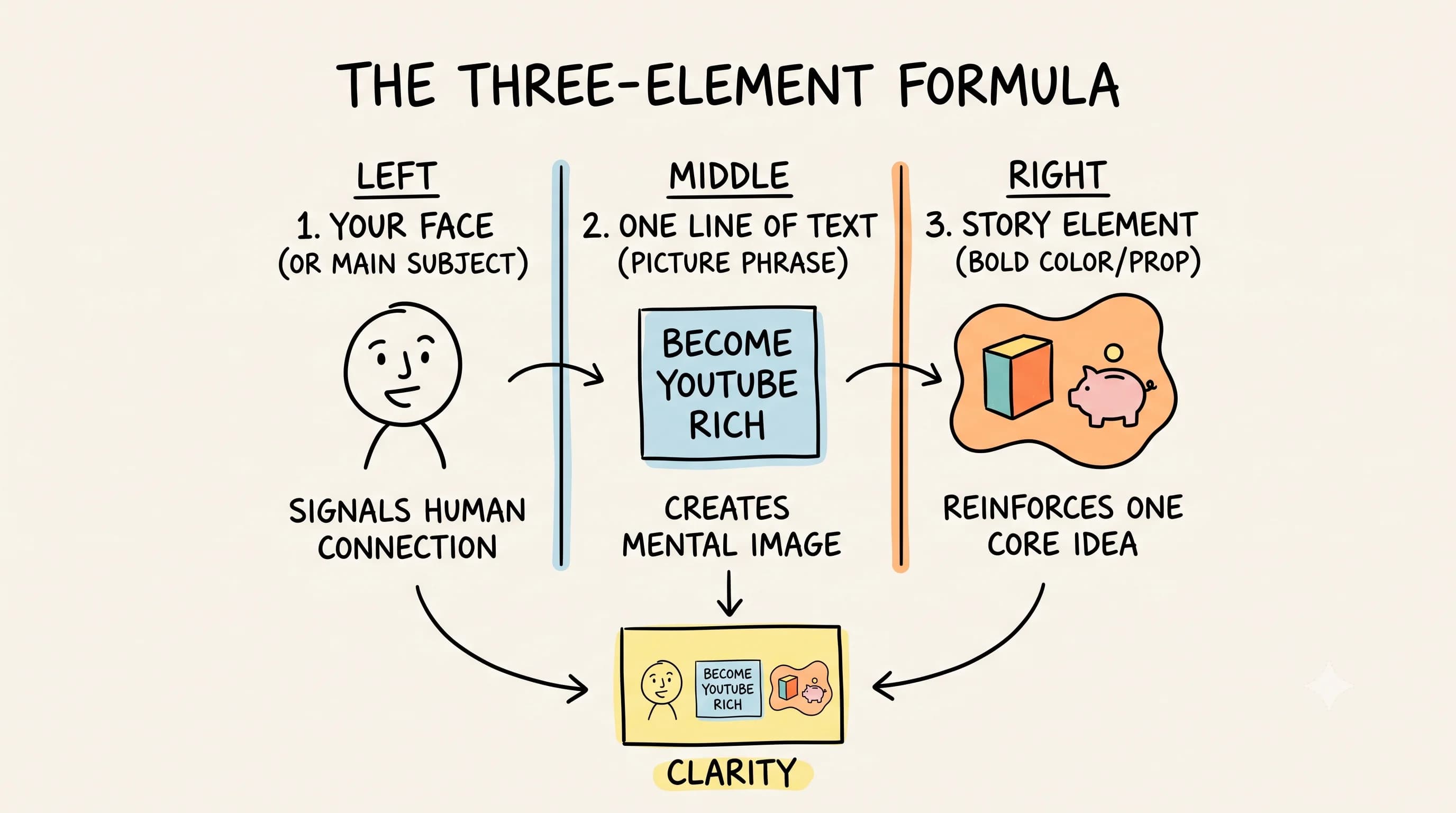
The three-element maximum rule is straightforward: when designing your thumbnail, you should have no more than three countable elements. These typically break down as your face, your text overlay, and your background or accent element. That is it.
If you can count four or more distinct things in your thumbnail, you need to simplify. This might mean removing a logo, cutting a second line of text, eliminating a graphic element, or stripping out a border. Every removal makes your remaining elements stronger.
This rule is not just one person's opinion. YouTube strategist Paddy Galloway explicitly promotes a three-element rule for thumbnails, finding that limiting a thumbnail to three elements dramatically improves clarity and CTR, based on pattern analysis of high-performing channels, especially in education and commentary niches where clutter severely hurts click-through. Thumbnail designer Trey Shields lands in the same place with his Rule of 3 formula: one face with emotion, one line of text under 30 characters, one story element such as a bold color. His conclusion? "That's it. Three elements. Nothing more."
The High CTR Thumbnail System states it even more directly: "You usually need 2 to 3 elements in a thumbnail. Never more," based on repeated testing of thumbnails in real feeds where thumbnails that failed almost always had too many countable elements.
For most educational creators, text is still essential. But even with text, the three-element framework holds. Face plus text plus background. That combination, executed with strong design choices, consistently outperforms busy alternatives. And if you can tell your story with two elements instead of three, SmallAI's guide notes that is even better.
The Squint Test: A Simple Way to Check Your Work
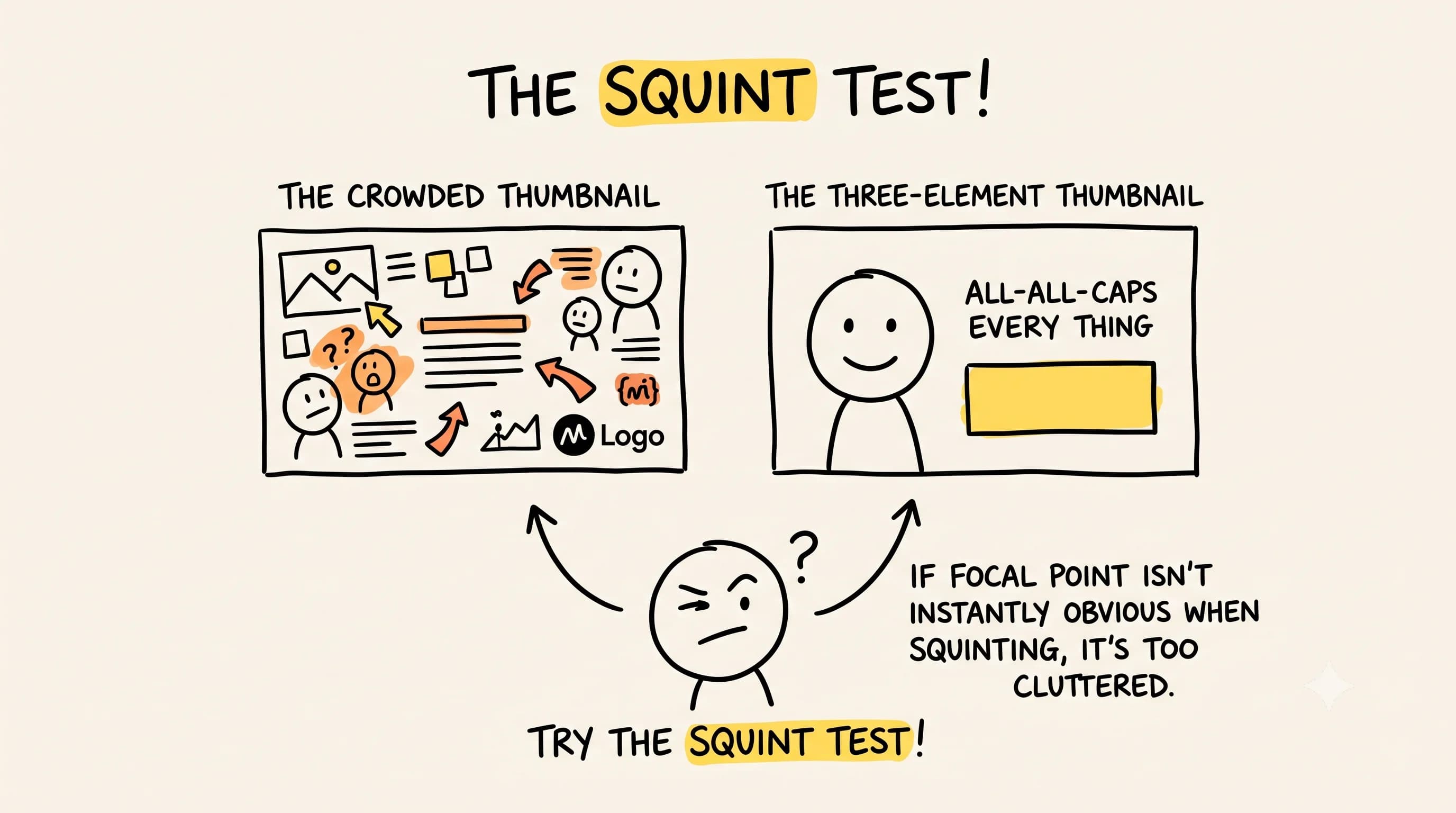 ThumbnailCreator's composition guide offers a practical way to self-audit any thumbnail you create: the squint test. Squint your eyes until the thumbnail becomes slightly blurry. If the main focal point is not immediately obvious, the thumbnail is too cluttered. Try it on your last five thumbnails right now. You will probably be surprised by what you find.
The idea behind the squint test is that your thumbnail needs to communicate at a glance, not after careful inspection. Viewers are not studying your thumbnail. They are scanning past it in a fraction of a second. If your core message is not visible the moment someone squints at it, you have too much going on.
Thumbnail Design Tips That Top Creators Actually Use
Designing Your Thumbnail Around a Single Core Idea
Every great thumbnail starts with a single question: what is the ONE thing you want viewers to understand immediately? Not three things. Not two things. One thing.
This core idea should drive every design decision. Your thumbnail image should reinforce it. Your text should amplify it. Your background should support it without competing with it. When you approach thumbnail design with this singular focus, your creative choices become much easier and your results dramatically improve.
YouThumb.ai's minimalist guide advises identifying the one core message, choosing a single focal point, and removing everything else if it does not serve that message. The most successful creators often use just a single image that communicates everything, no text required. That is the gold standard. The image alone tells the story. The viewer sees it and immediately understands the promise of the video.
Think about the most iconic thumbnails in your niche. They are memorable because they communicate one idea with total clarity. A face expressing shock. A bold claim in massive text. A dramatic before-and-after. One idea, executed powerfully.
How to Use Picture Phrases for Eye-Catching Thumbnails
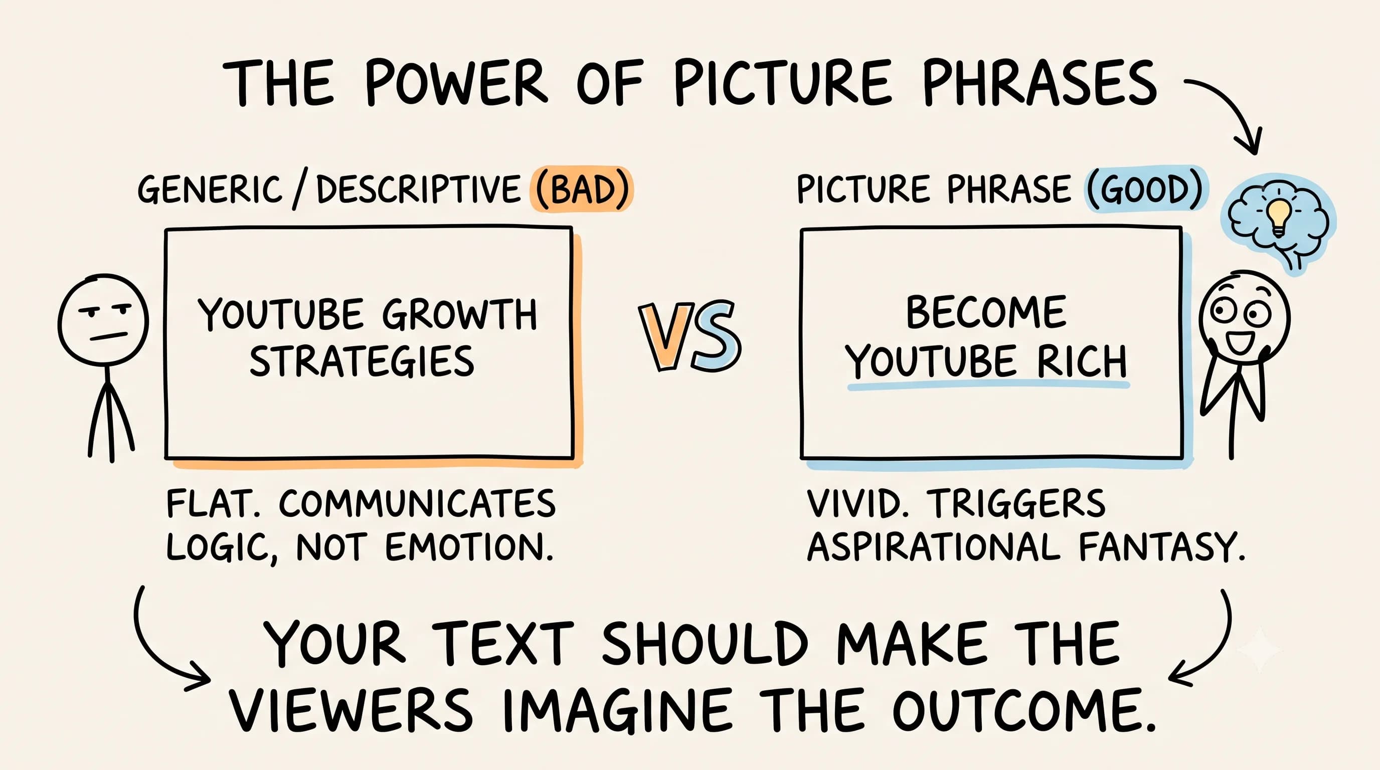 For educational content creators, text on your thumbnail is not just acceptable, it is often essential for click-through. But the type of text matters enormously. Generic or abstract phrases waste your limited real estate. What you want instead are what experienced creators call picture phrases.
A picture phrase is a combination of words that, when someone reads them, immediately triggers a vivid mental image. The goal is for your viewer to imagine themselves in the outcome the moment they read your thumbnail text. That mental transportation is what converts a scroll into a click.
Consider the difference between these two thumbnail text options for a video about growing a YouTube channel:
Option A: "YouTube Growth Strategies" Option B: "Become YouTube Rich"
Option A is descriptive and accurate but flat. It creates no emotional response and no mental image. Option B immediately places the viewer inside a fantasy. They picture themselves financially successful through YouTube. They feel aspirational energy. That feeling drives the click.
This approach is widely supported by research. Multiple sources including ThumbMagic and Mark Studios advocate for thumbnail text that adds meaning beyond the title, so that reading it makes the viewer imagine themselves in the outcome. ThumbMagic's 2026 guide specifically recommends limiting text to three to five words that are readable on mobile and emotionally resonant.
Effective picture phrases are typically two to four words maximum. They are specific enough to create an image but broad enough to apply to a large audience. They evoke emotion, aspiration, curiosity, or urgency. When you write your thumbnail text, test it by asking: does reading this create a vivid mental image? If the answer is no, rewrite it.
YouTube Thumbnail Best Practices by Content Type
Thumbnail Styles That Work for Educational YouTube Creators
Different thumbnail styles work better for different types of content, but the three-element rule applies across all of them. Here is how to apply it based on your content format:
For tutorial and how-to content, your most effective approach is typically face plus bold picture phrase plus clean background. Your face signals human connection and expertise. Your picture phrase communicates the transformation or skill. Your background provides contrast and keeps focus on the first two elements.
Mark Studios' CTR psychology research identifies this exact pattern among top creators: a face with exaggerated emotion plus a single prop or graphic plus a text overlay of three to five words maximum. That combination reliably outperforms thumbnails that deviate from it.
For opinion and commentary content, a strong emotional expression on your face combined with a short, provocative text statement often outperforms everything else. The emotion on your face and the text should reinforce each other, creating a combined message that feels urgent and unmissable.
For listicle and roundup content, consider leading with your strongest visual hook and a number. Numbers perform well because they set clear expectations. But even here, resist the urge to add more elements. Three maximum.
A creator on Reddit's r/PartneredYoutube who spent considerable time obsessively studying high-performing thumbnails and thumbnail experts reached a consistent conclusion: top performers focus on one main subject, use very few words, and avoid clutter and multiple small objects. That pattern holds across niches, content types, and channel sizes.
Creating a Brand-Consistent Thumbnail Template
Once you understand the three-element rule, the next step is building a thumbnail template system that maintains brand consistency across your channel. Consistent thumbnails build brand recognition over time, so viewers can identify your content instantly in their feed even before reading your video title.
Your template should establish consistent font choices, a consistent color palette, and a consistent placement structure. MittalMarHQ recommends organizing your three elements as main subject, supporting text of two to three words maximum, and background element, noting that more elements create competing focal points and break visual hierarchy. This does not mean every thumbnail looks identical, but it means viewers develop a visual association with your style. That recognition builds trust, and trust increases click-through rate over time.
When building your template, keep the three-element rule baked into the structure. Leave room for face placement, one text zone, and one background or accent treatment. Resist the temptation to add additional template elements just because the space exists. Empty space is not wasted space in thumbnail design. It is breathing room that makes your key elements stand out.
Thumbnail and Title Strategy: Making Them Work Together
How Your Video Title and Thumbnail Create a Complete Package
Your thumbnail and title are partners. They should work together to create a complete picture, not repeat the same information. A strong thumbnail and title combination gives viewers complementary information that together creates irresistible curiosity.
If your thumbnail shows your shocked face next to the text "It Actually Works," your video title might explain what it is. The thumbnail creates curiosity and emotion. The title provides context and keywords. Together they form a click package that works harder than either element alone.
Avoid the common mistake of having your thumbnail text simply repeat your video title word for word. This wastes the opportunity to create layered communication. Instead, treat your thumbnail text as the emotional hook and your title as the logical explanation. One speaks to the heart, one speaks to the head.
TechSmith's YouTube thumbnail best practices recipe reflects this same thinking, recommending one focal image, one line of text, and one supporting element, with each piece serving a distinct purpose in the overall communication package.
How to Check Your Thumbnail Click-Through Rate and Improve It
Using YouTube Analytics to Evaluate Different Thumbnail Approaches
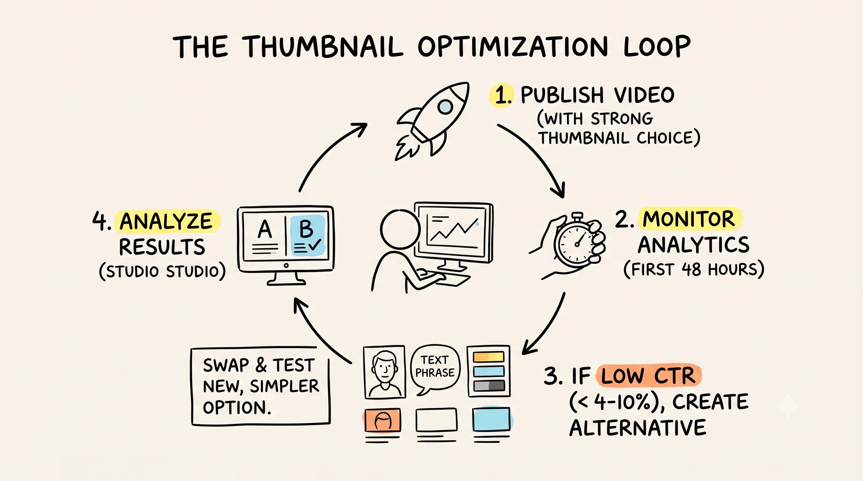
YouTube Studio gives you direct access to your click-through rate data at the video level. This is your most important feedback loop for thumbnail performance. A healthy click-through rate typically falls between four and ten percent, though this varies by channel size, niche, and traffic source.
When you publish a new video, monitor its click-through rate during the first 48 hours. This early data tells you how your thumbnail and title combination is resonating with your existing audience and with browse traffic. If your click-through rate falls below your channel average, consider updating your custom thumbnail.
YouTube allows you to swap out thumbnails after publishing, which means you can test different thumbnail styles on the same video. This is one of the most powerful optimization tools available to creators and most people underuse it completely. Create multiple thumbnail options for your next video, publish with your strongest choice, and if the numbers are not where you want them within a few days, swap it out and test something simpler.
Start Simplifying Your Thumbnails Today
The three-element maximum rule is not a creative limitation. It is a creative constraint that forces clarity, and clarity is what drives clicks on YouTube.
Here is your action plan. Go look at your last five thumbnails right now. Count the elements in each one. For every thumbnail where you can count four or more elements, make a list of what to remove. Then rebuild those thumbnails with three elements maximum.
Next, audit the top creators in your niche. Study their best thumbnails. Notice how minimal they are. Notice how clearly they communicate. Notice how the thumbnail image does most of the heavy lifting without requiring the viewer to work hard to understand the message.
Finally, start practicing picture phrase writing. For your next video, write ten possible thumbnail text options. Test each one by asking whether it creates a vivid mental image. Choose the one that creates the strongest, most aspirational picture in the shortest number of words.
Your YouTube thumbnail is often the first and only impression you get with a potential viewer. Make it count by making it simple, bold, and instantly communicative. The creators winning on YouTube have already figured this out. Now you have too.
Read more about Becoming a Content Creator
📚 Complete Guides
- How to Become a Content Creator: Complete Beginner's Guide
- Content Creator Platform Guide: Choose the Right Platform to Start Your Creator Journey
⚡ Tactics & Strategies
- 50% Retention Rate Optimization for YouTube Algorithm Success
- Age Bracket as Superpower Strategy for Older UGC Creators
- AI Workflow Integration for Content Reduction
- Audience Consistency Strategy to Avoid Algorithm Penalties
- Audience Poll on Instagram to Source Q&A Content in Advance of Recording
📄 Related Articles
- Voice of the Customer: A Creator's Guide to Magnetic Messaging
- Content Creator Burnout: Signs, Prevention, and the Mindset That Fixes It
- Influencer Authenticity: How Honest Product Reviews Drive Real Influence
- TikTok Creator Search Insights: How to Find Content Gaps That Guarantee Views
- The AI Content Creation Workflow: Turn 37 Seconds Into 1,200 Words
- The AI Content Workflow That Cuts Production Time by 70%
- Influencer Campaign Report: How Smart Reporting Systems Build Stronger Brand Relationships
- How to Ask Someone to Be on Your Podcast (And Actually Get a Yes)
Read more about Systems, Workflows & Operations for Content Creators
Read more YouTube Resources for Content Creators
📚 Complete Guides
⚡ Tactics & Strategies
- 50% Retention Rate Optimization for YouTube Algorithm Success
- Candy vs Vegetables Packaging Strategy for Educational Content
- Click-Through Rate Optimization as YouTube's Primary Success Metric
- Creating Viral Content Through Polarizing and Educational Hooks
- Doubling Production Effort Per Video to Exponentially Increase Views
🧮 Calculators

Alex Kirillov
Details
One link. Every channel, rate, and piece of work brands need to evaluate you. Built for how creators actually get hired.
Claim your profile
Live creator, content, and marketing roles from real companies, with the pay, market, and context the raw job page never gives you.
Browse jobs